 Munchkin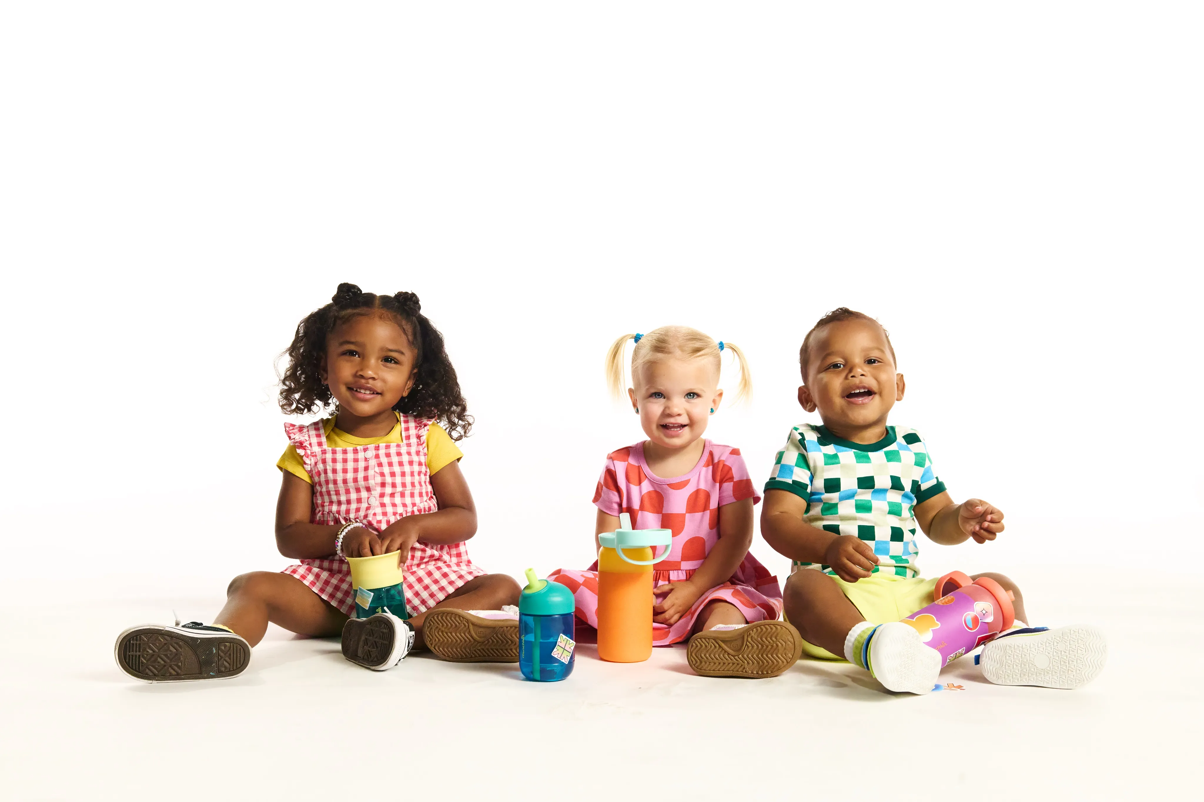
It’s the Little Things
Munchkin
- Strategy
- Creative Direction
- Brand Design
- Animation
- UX/UI Design
Munchkin, the trusted leader in baby and toddler drinking solutions for more than 30 years was entering a new era of cup design.
Six new and reimagined products introduced more modern forms, playful colours and thoughtful features designed around the realities of raising children.
Our challenge was to launch them as more than a collection of new products. We needed to create a major category moment—building excitement around the new generation of cups while giving every individual product a clear and compelling reason to choose it.
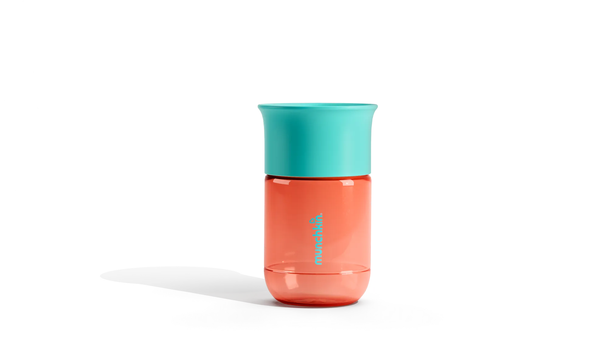
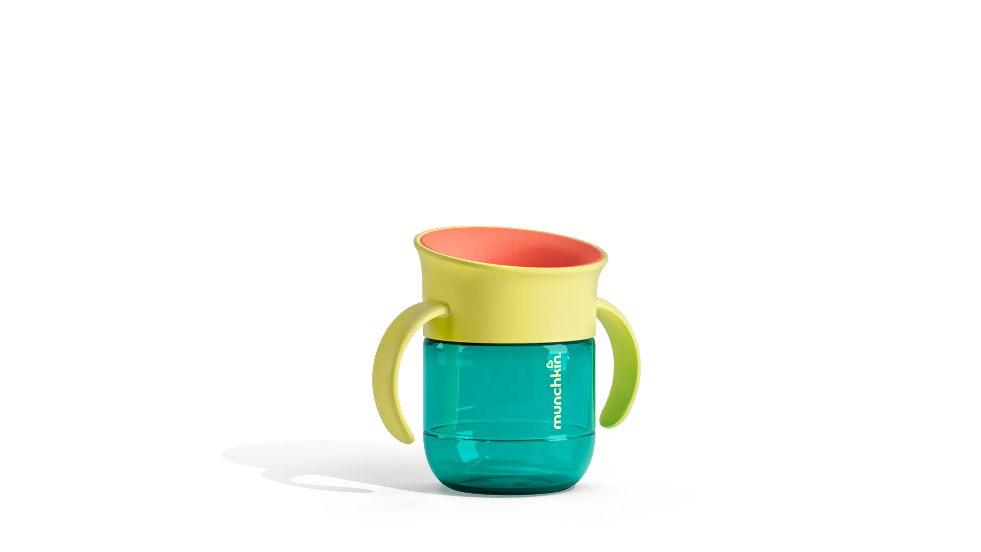
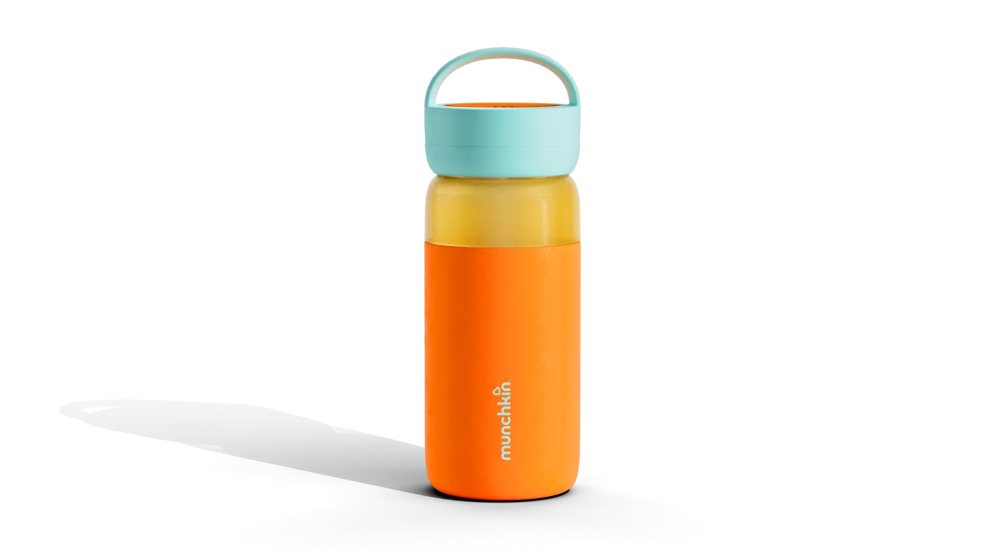

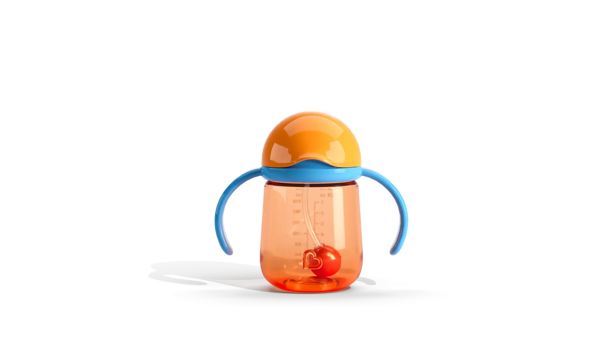
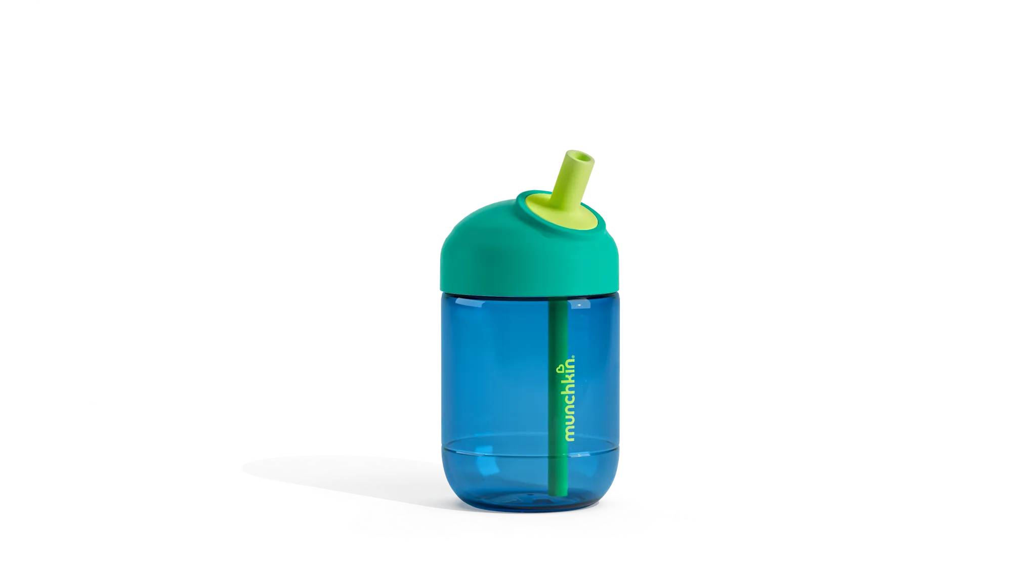

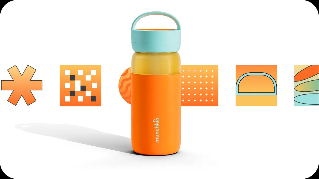
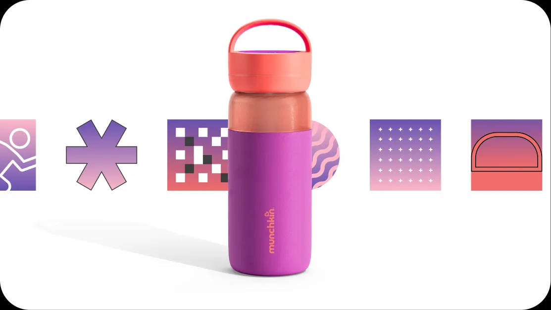
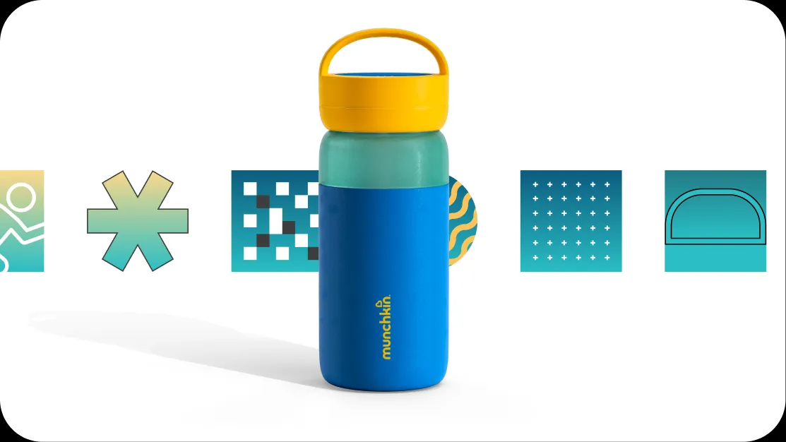
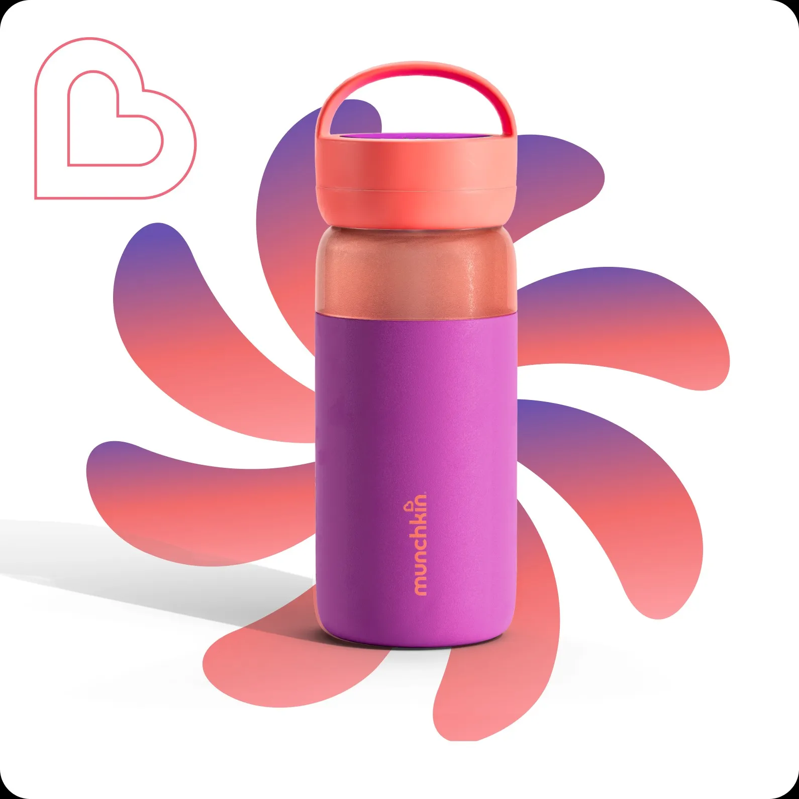
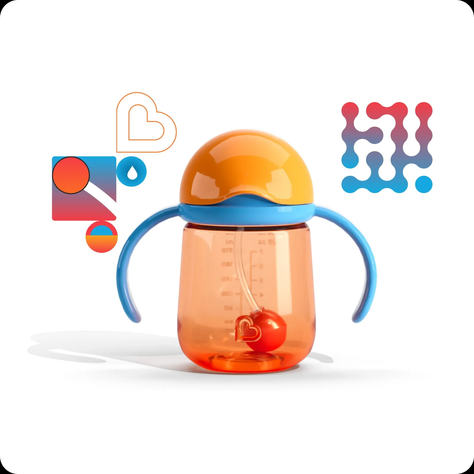
We transformed the thoughtful details behind Munchkin’s new generation of cups into an expressive system of glyphs — making every feature benefit easier to feel and the entire category impossible to overlook.


































270px
180px
90px
60px
30px
Art & System
Each glyph begins with something real: a sipping edge, weighted straw, locking lid, handle, flow or distinctive product form. Rather than simply decorating the campaign, the symbols reveal what makes each cup useful and unique. Different cups retain their own shapes, colours and personalities while clearly belonging to one new generation of Munchkin design.
For individual products, the glyphs isolate the features that solve a particular parenting need.
Across the full range, the symbols combine into a flexible and cohesive visual world. It could explain a single feature, celebrate an individual cup or create a high-impact expression of the whole category.
Copy
We embedded each product name directly into the copy line—making it part of the message rather than a label added to it.
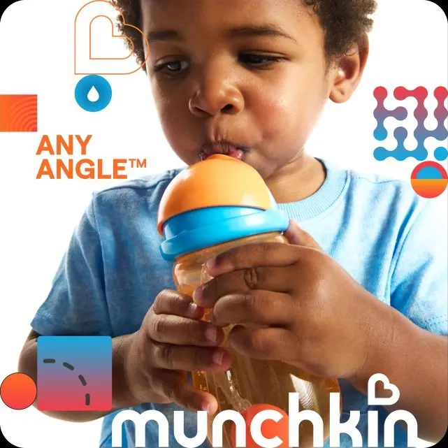
At the same time, functional benefits were dressed up as emotional impact: Click Lock became reassurance, Any Angle became relief, Perfect Angle became confidence and Control Flow became growing independence.
The mechanic made unfamiliar names instantly meaningful by connecting what each product did with how it made parents and children feel.

Motion
Motion brings ‘The Little Things’ to life via a disciplined framework.
While each glyph animates its own defining characteristic, the overall motion language is deliberately restrained, keeping the product firmly in focus.
Built around a binary rhythm and precise horizontal and vertical movement, glyphs behave in clusters that travel, expand and contract to serve copy, imagery or footage while remaining controlled and cohesive.
The system can be playful, dynamic and expressive without becoming overly distracting.
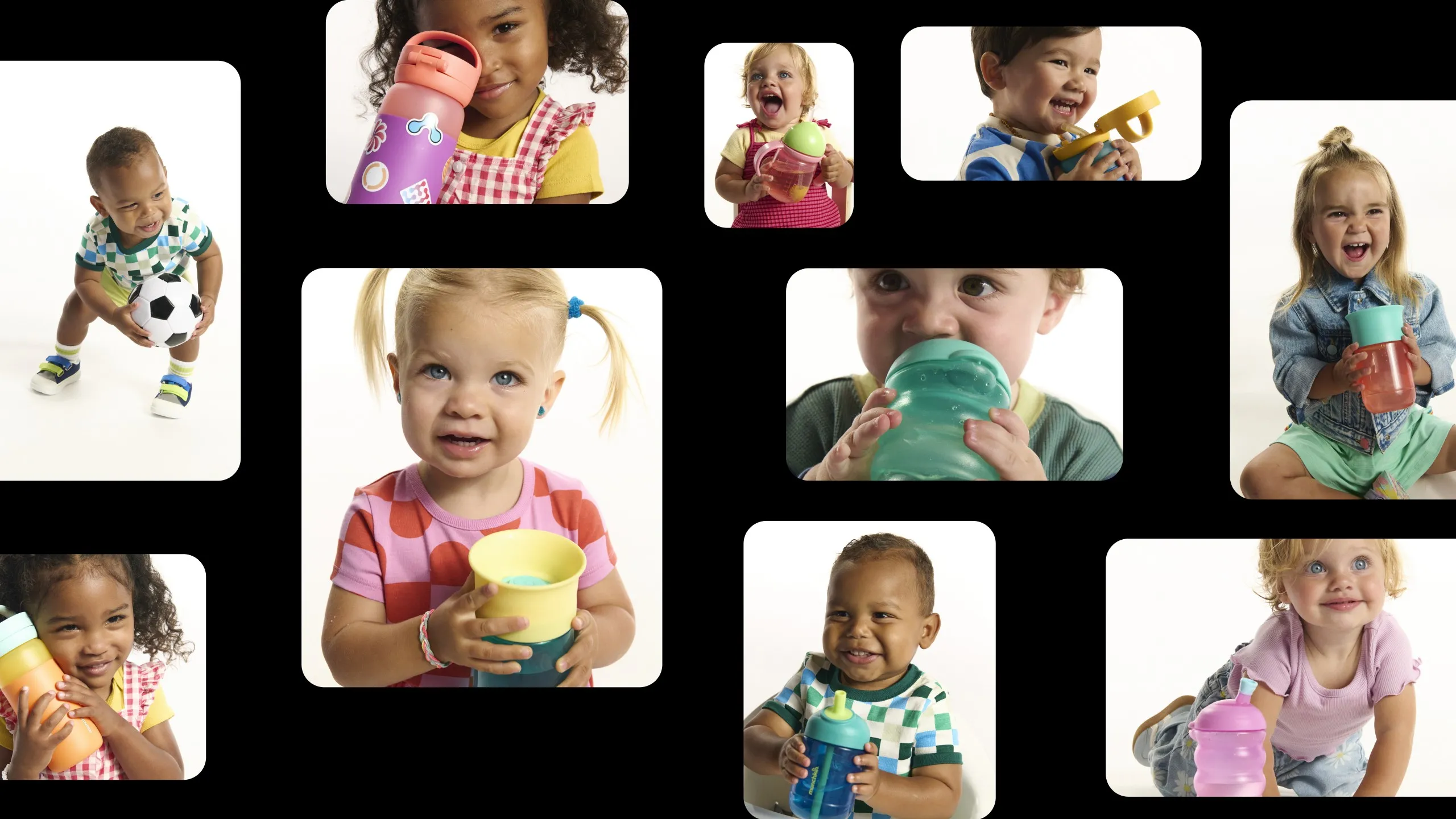
Designed to flex effortlessly across the customer journey—from launch communications & email, social content to landing and product pages, packaging, retail and film.


Social
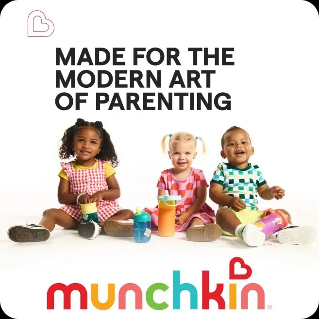
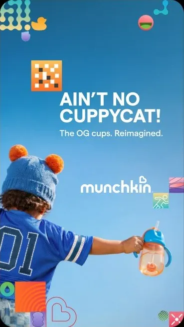
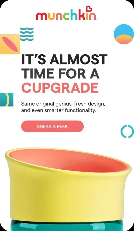
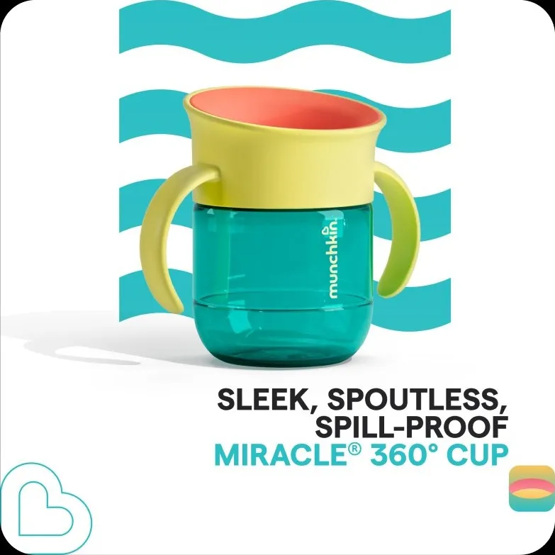
Across social, the creative flexed with the customer journey. Lifestyle content built emotional connection by showing the products in kids hands, while function and feature-led creative turned thoughtful details into simple, compelling reasons to choose.
Together, they created a distinct rhythm across the funnel: building recognition and relevance up top, then giving parents the confidence to act.






Social
Across social, the creative flexed with the customer journey. Lifestyle content built emotional connection by showing the products in kids hands, while function and feature-led creative turned thoughtful details into simple, compelling reasons to choose.
Together, they created a distinct rhythm across the funnel: building recognition and relevance up top, then giving parents the confidence to act.
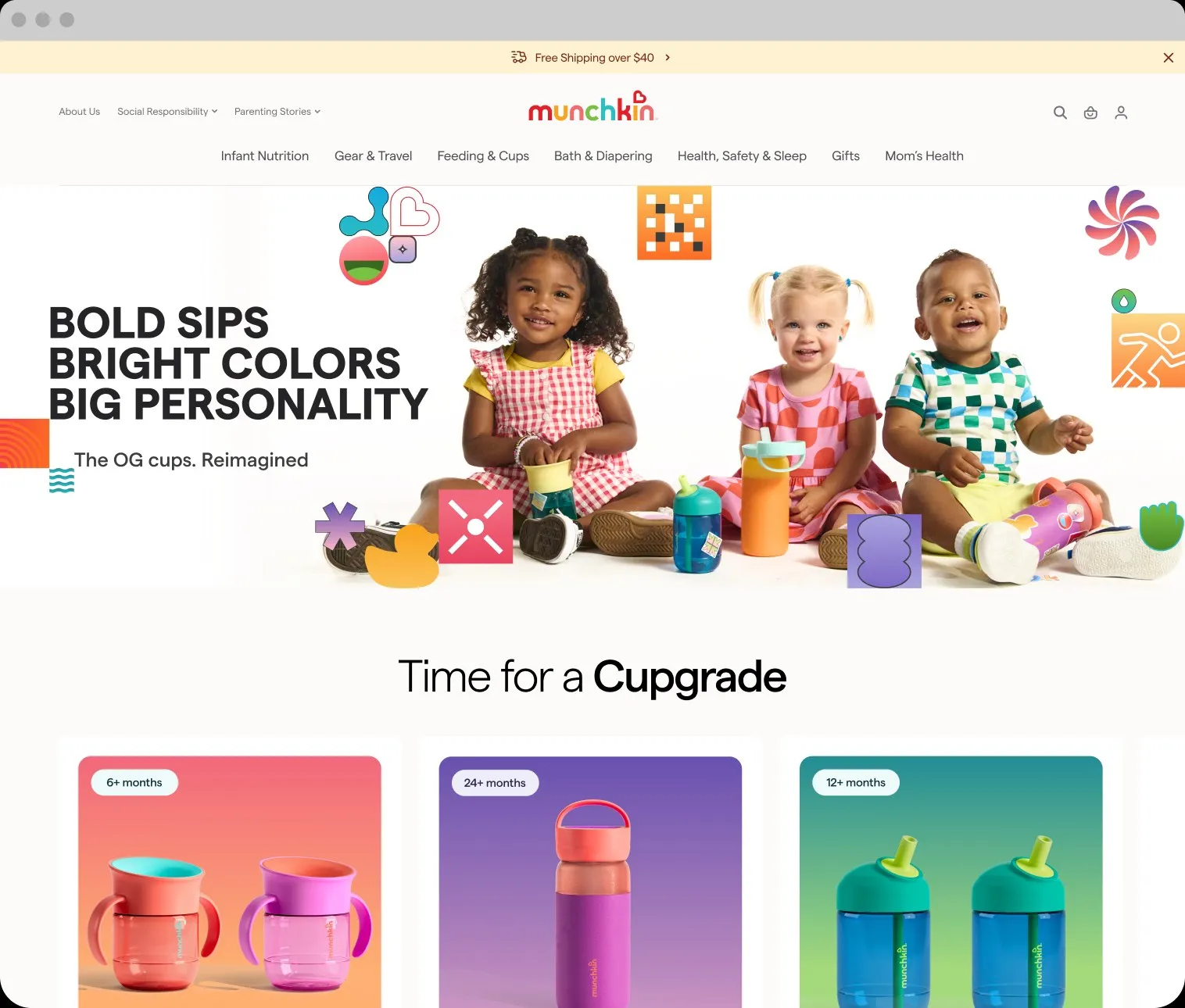
Website
Where the campaign became commerce, turning a creative platform into a performance tool.
The site adapts the visual language, personality and storytelling through to product discovery, while organising the extensive range around a clear “every age & stage” proposition.
Product benefits, developmental milestones and direct paths to purchase work alongside the brand idea, proving that campaign creativity and performance marketing don’t have to operate separately.
The result is an experience designed to build the brand while helping parents understand the range, find the right cup and buy it.
View Website
The Little Things gave Munchkin a distinctive way to communicate the intelligence behind its products—balancing clarity with character, and individual product stories with one cohesive category identity.

Something stuck,
changing or
moving
fast with your brand?
Let’s talk