 The Fatherie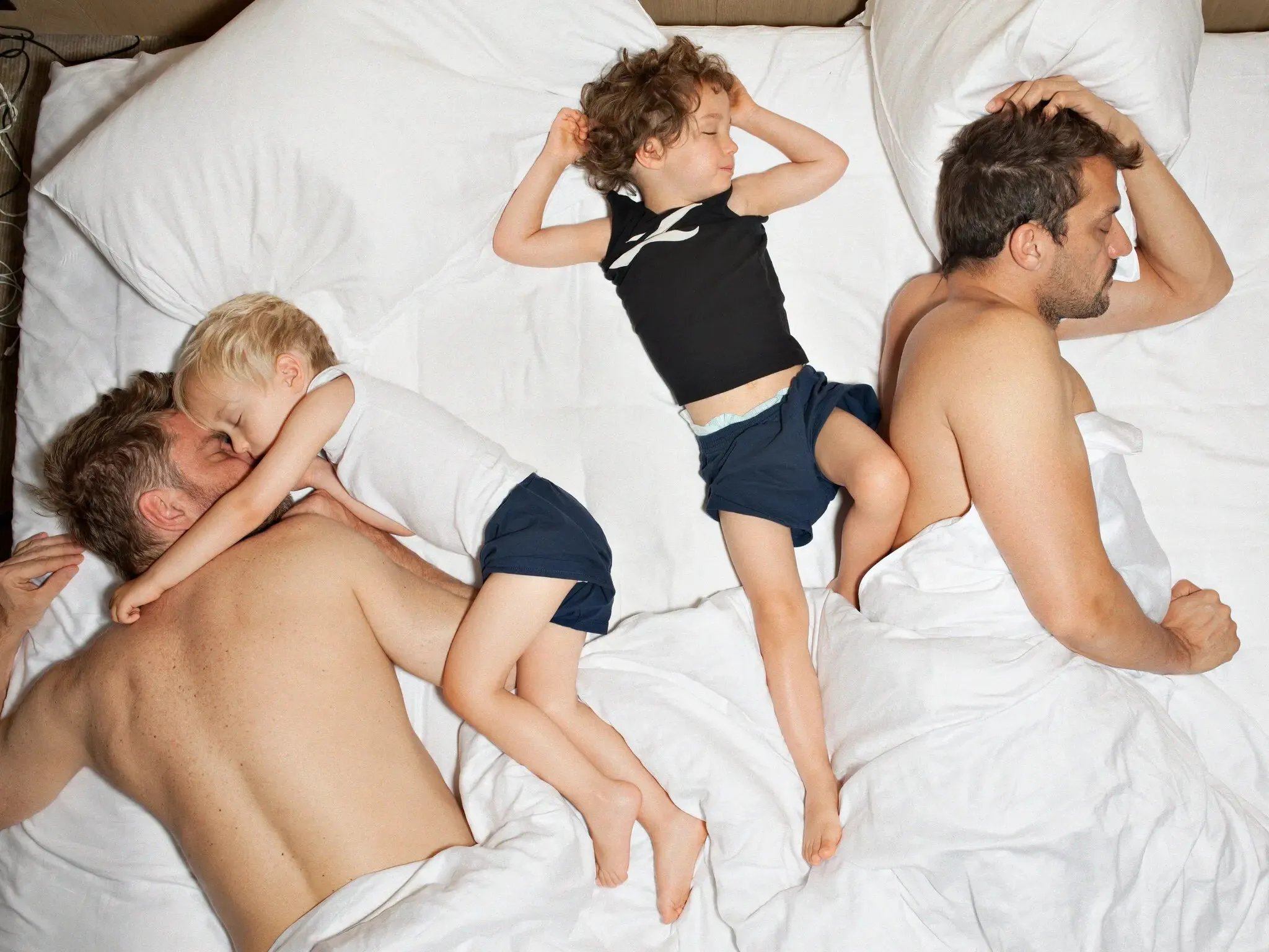
The Home for Queer Dads
The Fatherie
- Strategy
- Creative Direction
- Brand Design
- Animation
- UX/UI Design
The Fatherie was born out of lived experience—a search for queer fatherhood reflected in the world, and the frustration of finding little representation, support or community.
While mainstream gay culture often centred on nightlife and freedom, there was no clear path for those dreaming of a different kind of sleepless night. The Fatherie set out to create an entry point for anyone curious, preparing for or already on the journey to becoming a dad.
Our challenge was to build a distinct identity for something part lifestyle brand, part movement and part community. It needed to carry advocacy, resources and support while feeling considered yet rebellious, witty, joyful and radical—creating a place where queer dads could feel seen, supported and empowered.
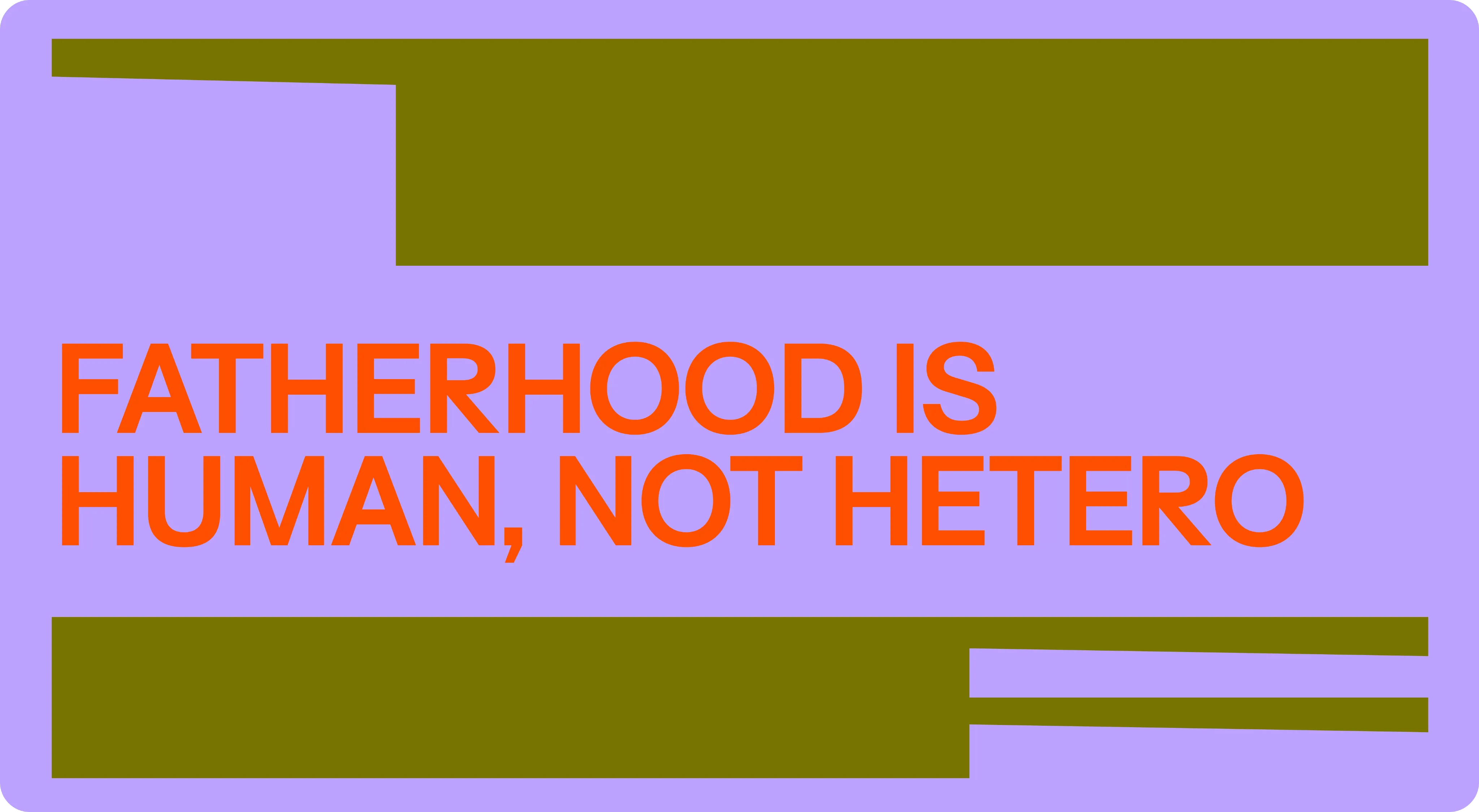
We made space the organising idea for the brand—creating room for emerging ideas of family. Proudly forging, framing and (re)defining it for gay dads, the dad-curious and dads-to-be.
Lockup
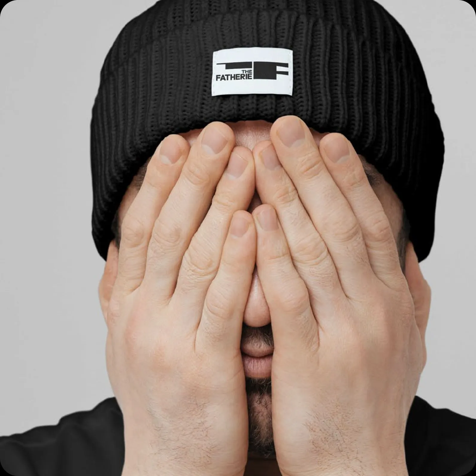
Our primary logo lockup brings together our wordmark and The Anvil symbol as a unified mark.
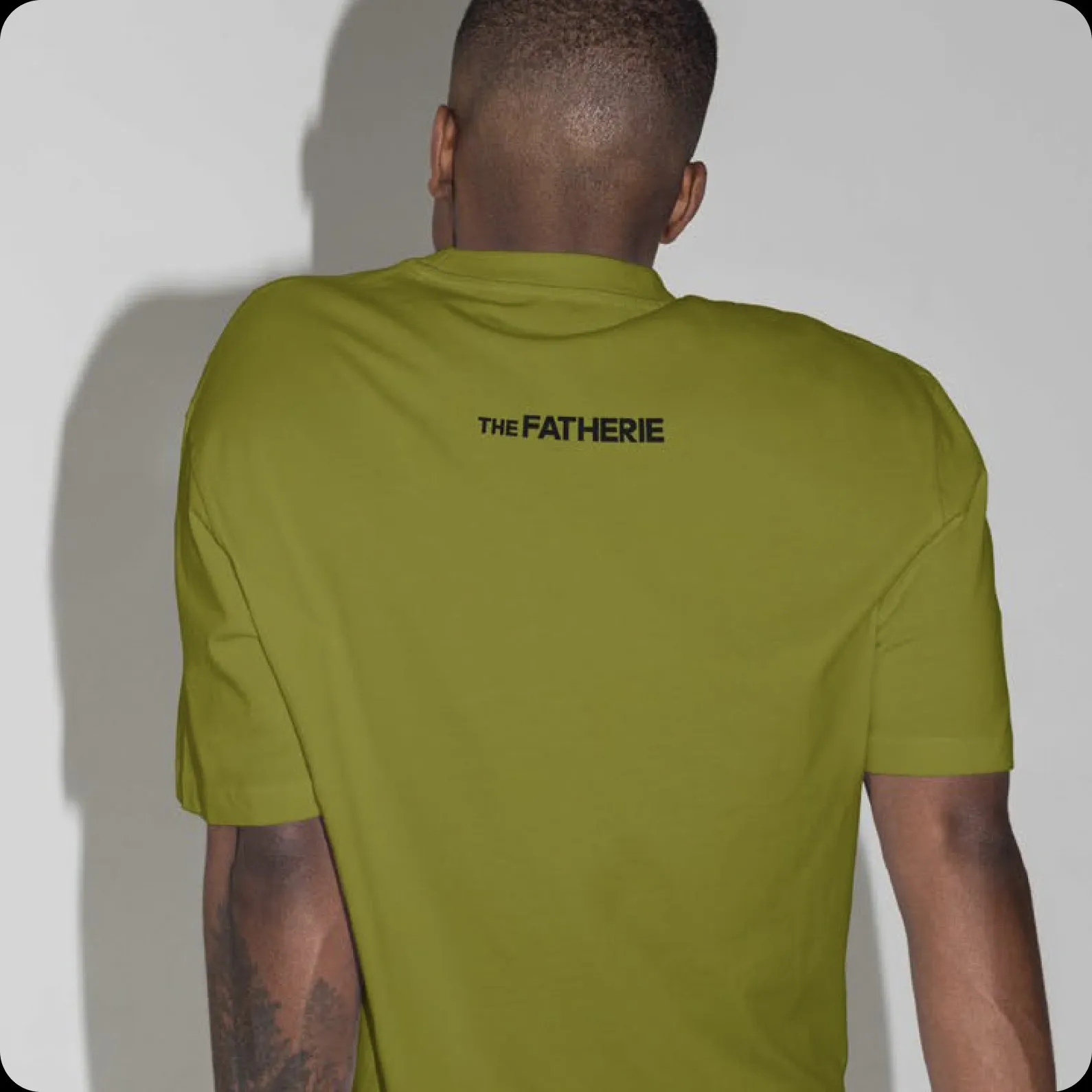
The wordmark itself is unapologetically modern with radical clarity.
Set in Surt Expanded Black, the wordmark’s bold, precise form ensures strong legibility in print and digital.
It exists also in a stacked composition when we literally or otherwise need to express a fraction more volume or take up more space ;)
Symbol
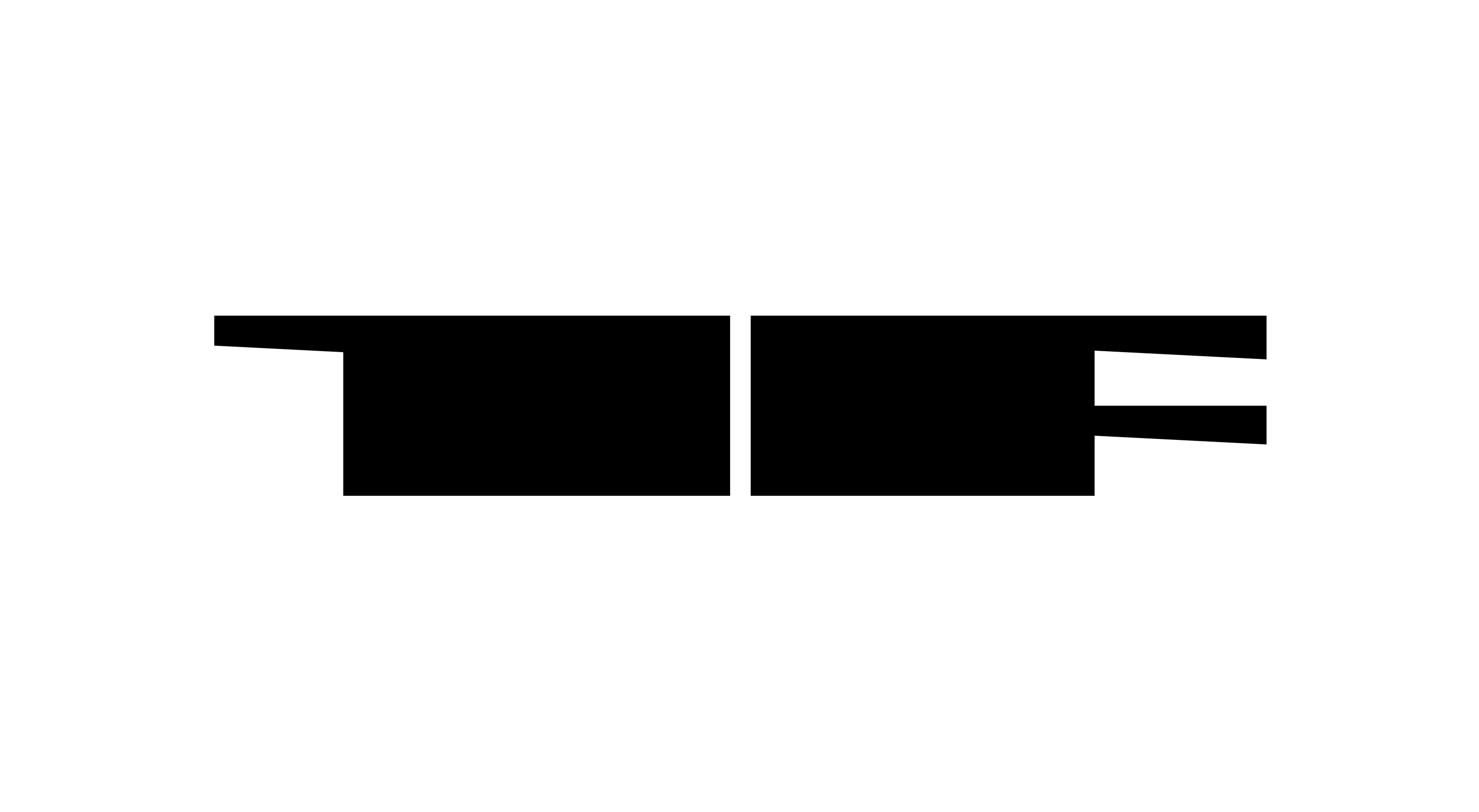
Our symbol combines the letters ‘T’ and ‘F’ into a singular brand mark we call The Anvil.
Solid and structural, it forms the backbone of our visual identity — a confident anchor for the brand.
The Anvil embodies resilience and craft, a reminder that fatherhood is forged through care, patience, and strength.
Designed to hold its own across different contexts, the symbol carries both weight and warmth. For maximum impact, it should be used boldly and without hesitation — a statement of strength and presence.
Color
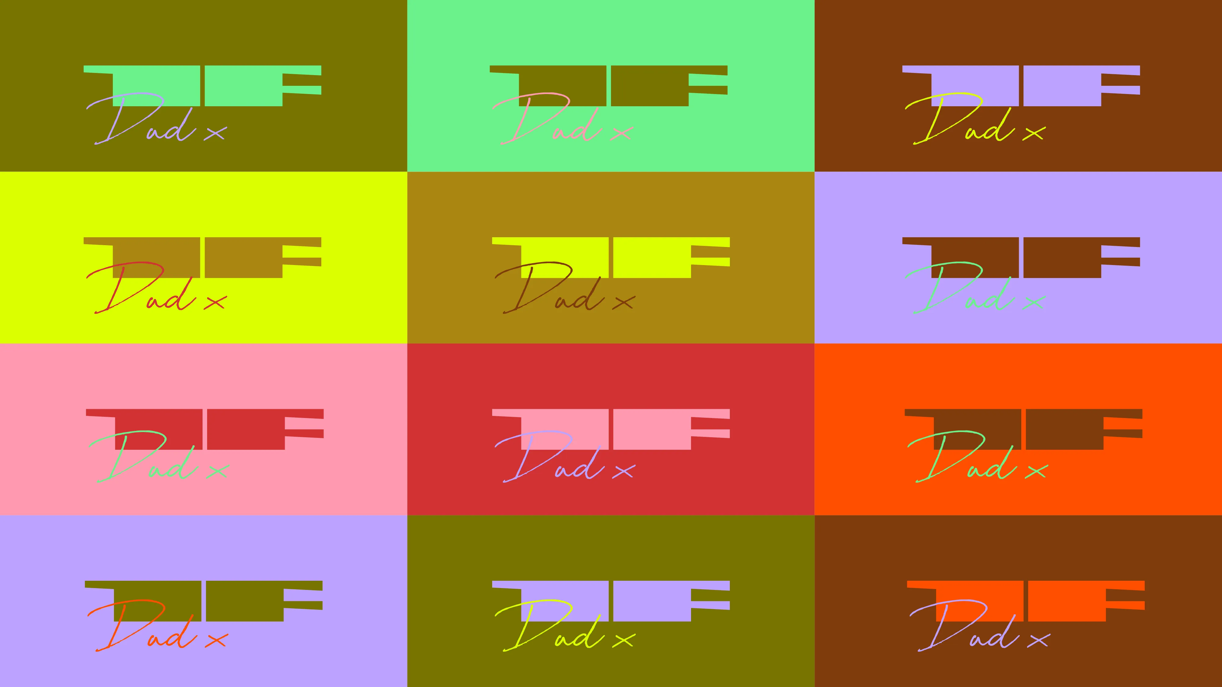
This is where the radical spirit of the brand comes to life. Colour is not decorative but declarative. A statement of visibility, rebellion and joy.
The power of the palette lies in its contrast: vibrant, energetic tones set against calm, grounded neutrals. Together they create balance — impact with clarity, expression with intention.
Two or three colours can be combined within a single composition to create contrast and rhythm.
Typography
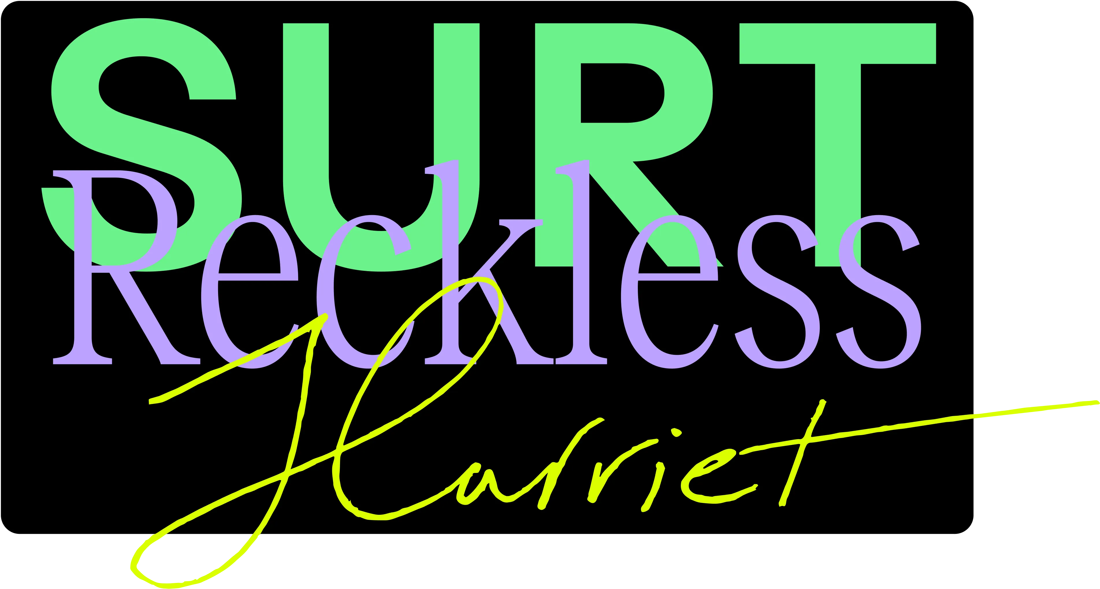
The Fatherie’s typographic system is built around three distinct typefaces, each serving a clear role within the identity.
Together they create a balance of structure, expression and personality — from confident statements to moments of warmth and humanity.
This combination allows the brand to shift tone seamlessly across applications, while always remaining cohesive and recognisable.
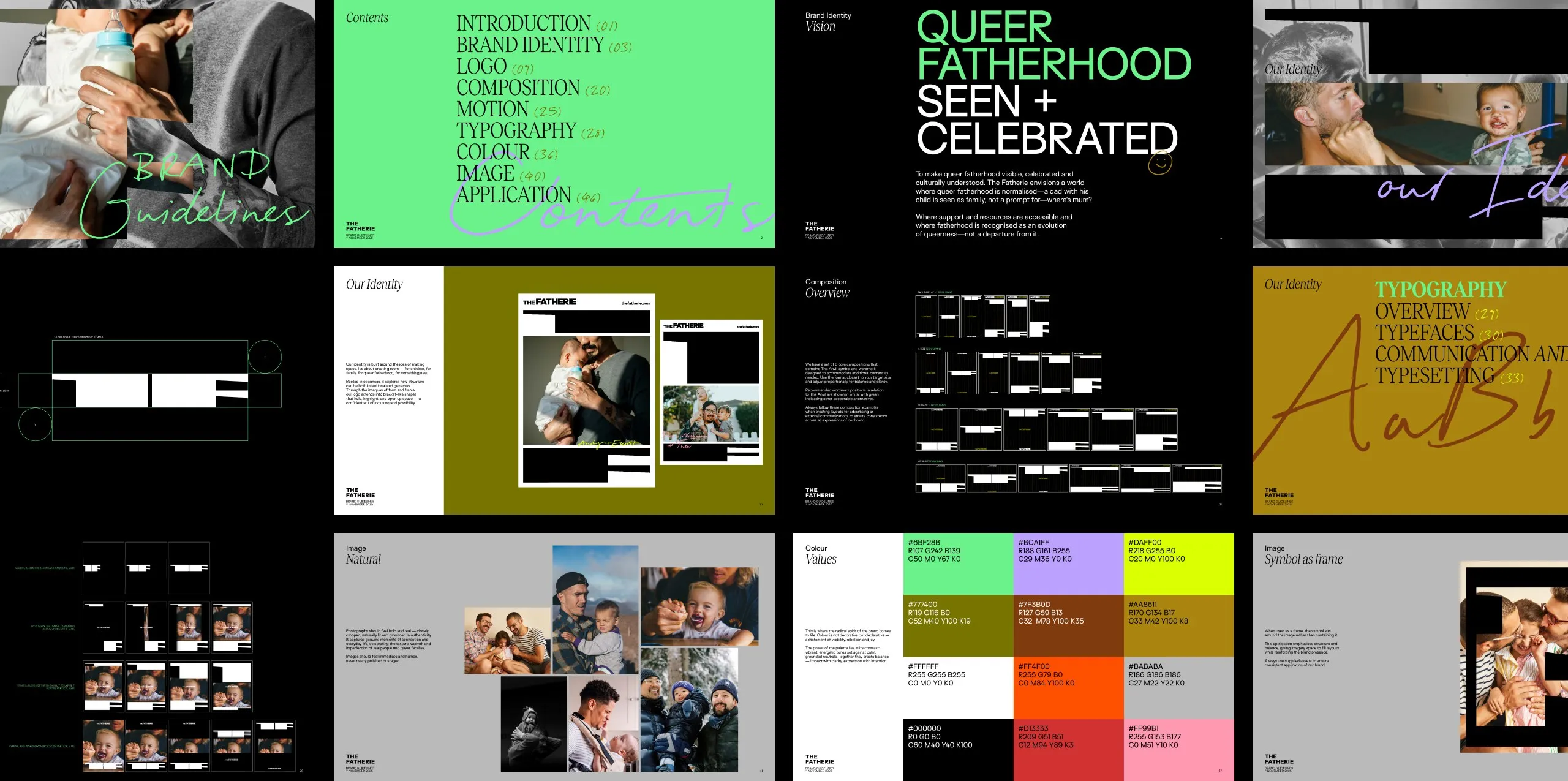
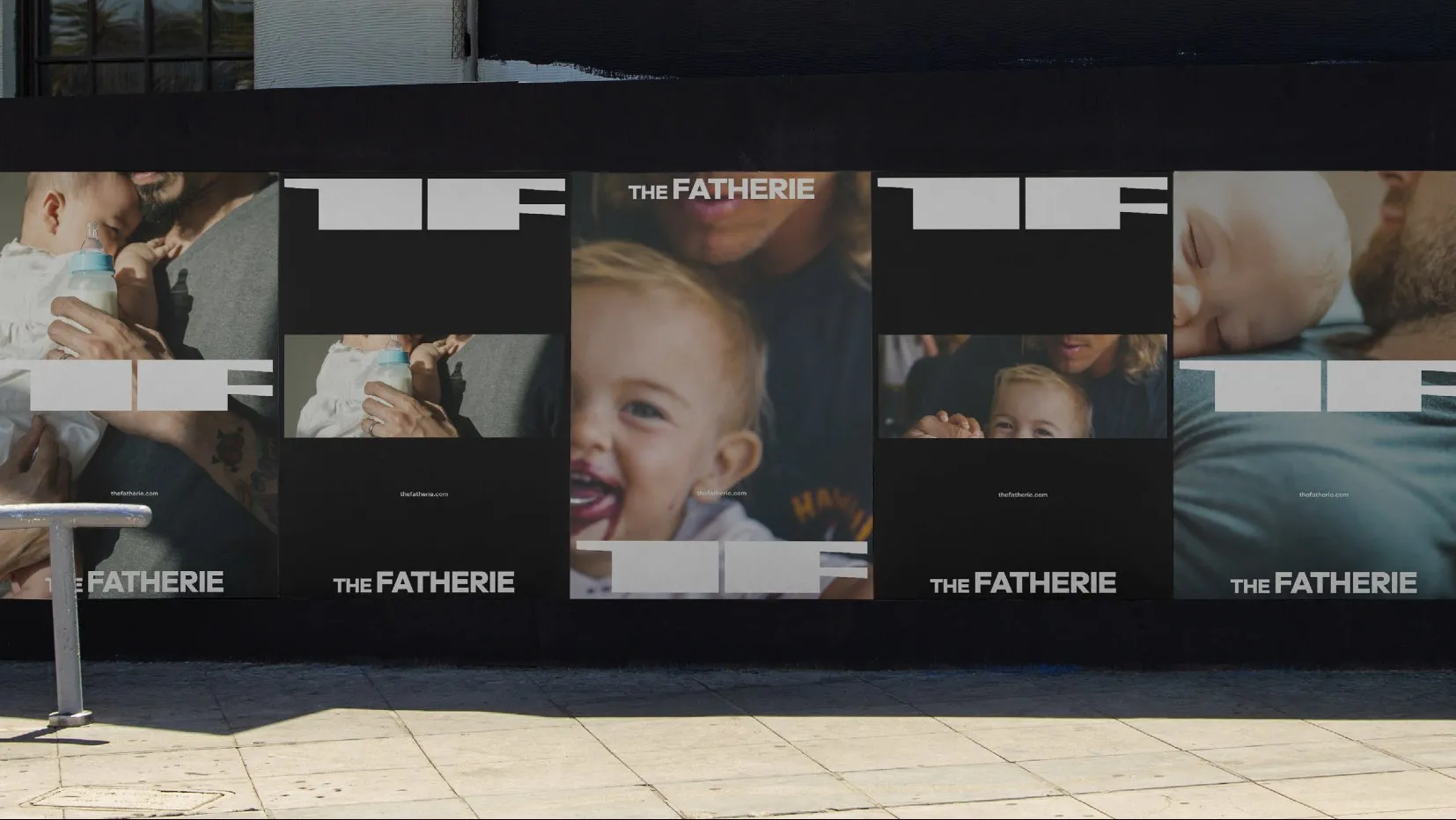
Built to shift between care and provocation, the system gives The Fatherie a variable volume. Bold statements challenge convention; intimate stories create connection; photography brings warmth and the texture of lived experience.
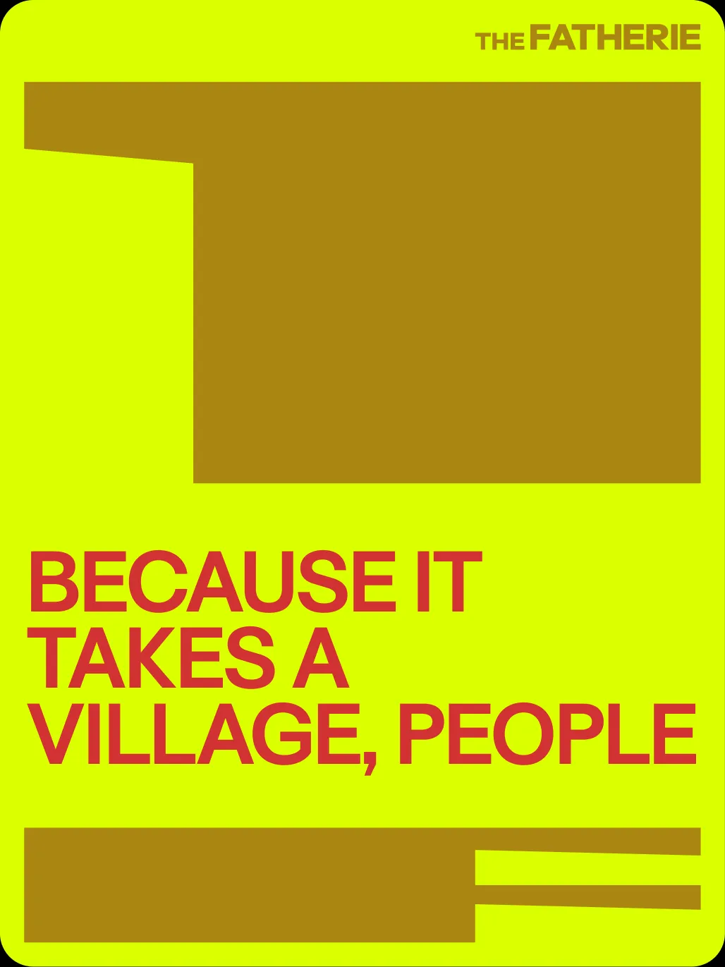
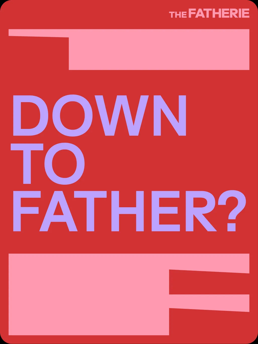
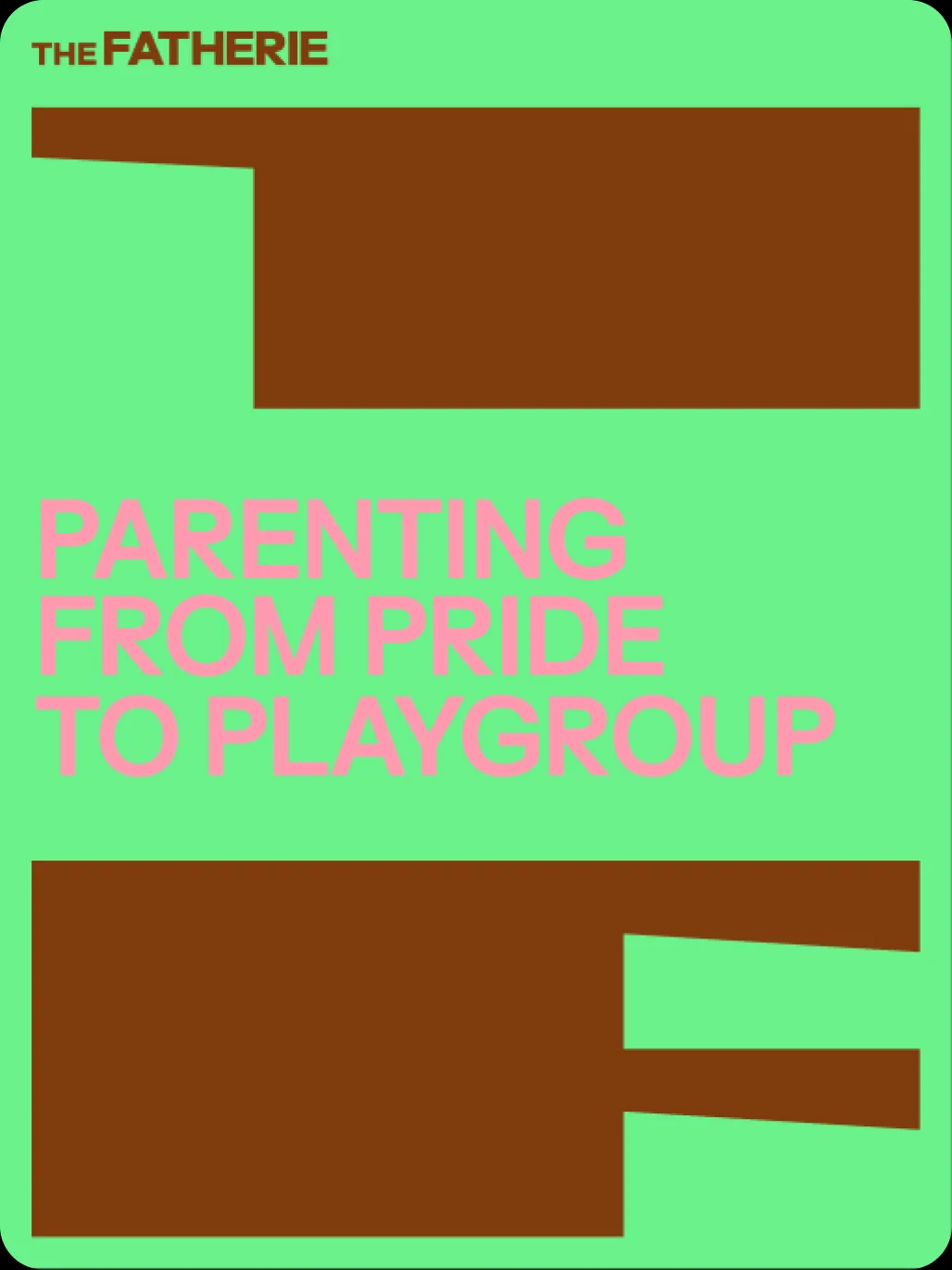
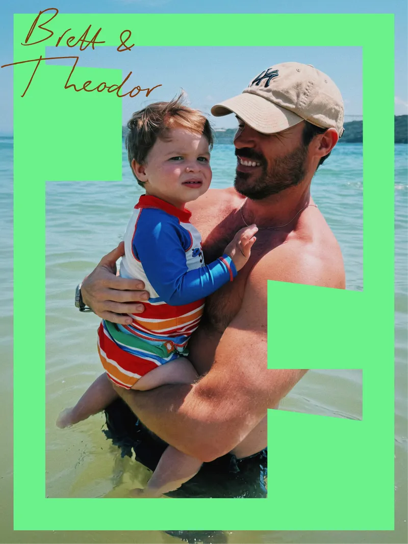
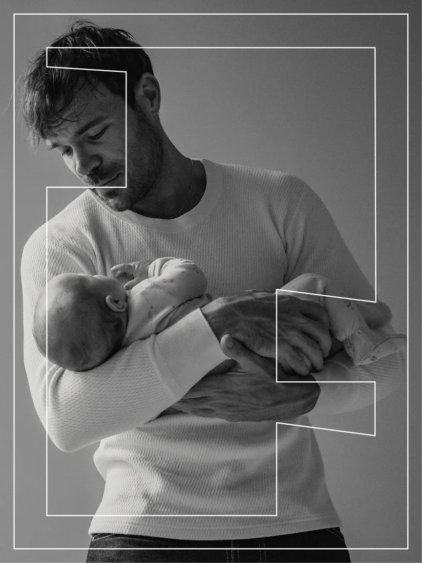
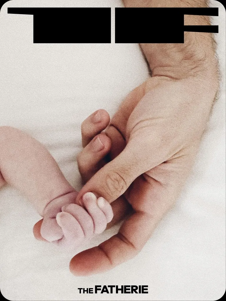
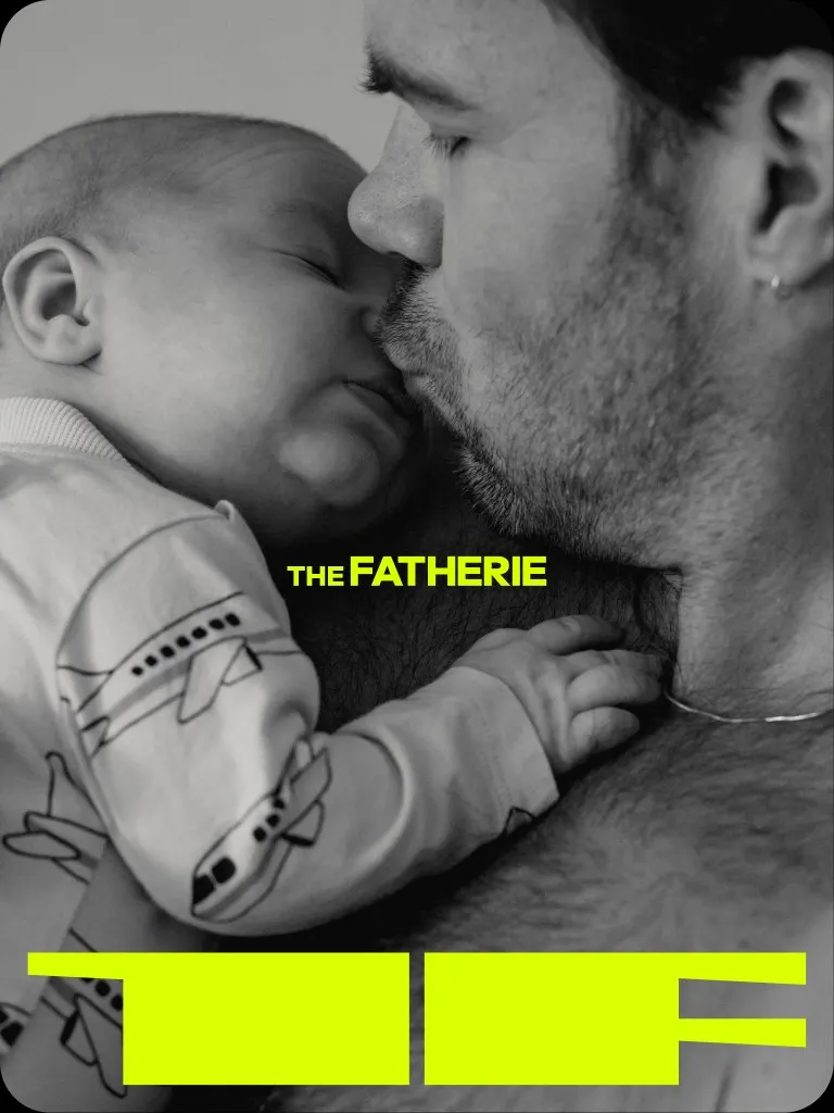
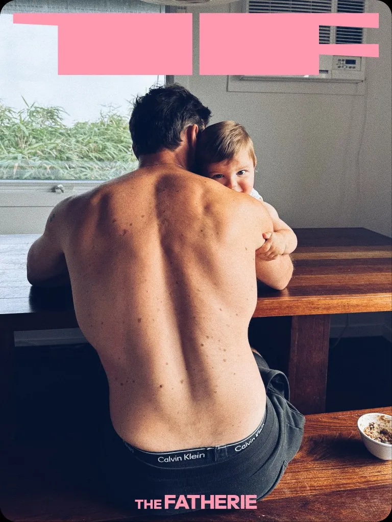
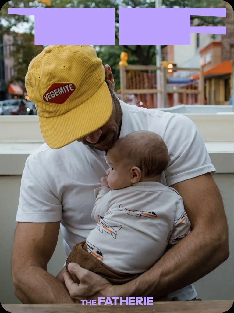
From social and editorial to apparel, campaigns and the street, The Fatherie turns care into an act of radical visibility. The result is more than an identity: it is a recognisable home for queer dads—and a more expansive picture of who gets to be called Dad.
Something stuck,
changing or
moving
fast with your brand?
Let’s talk